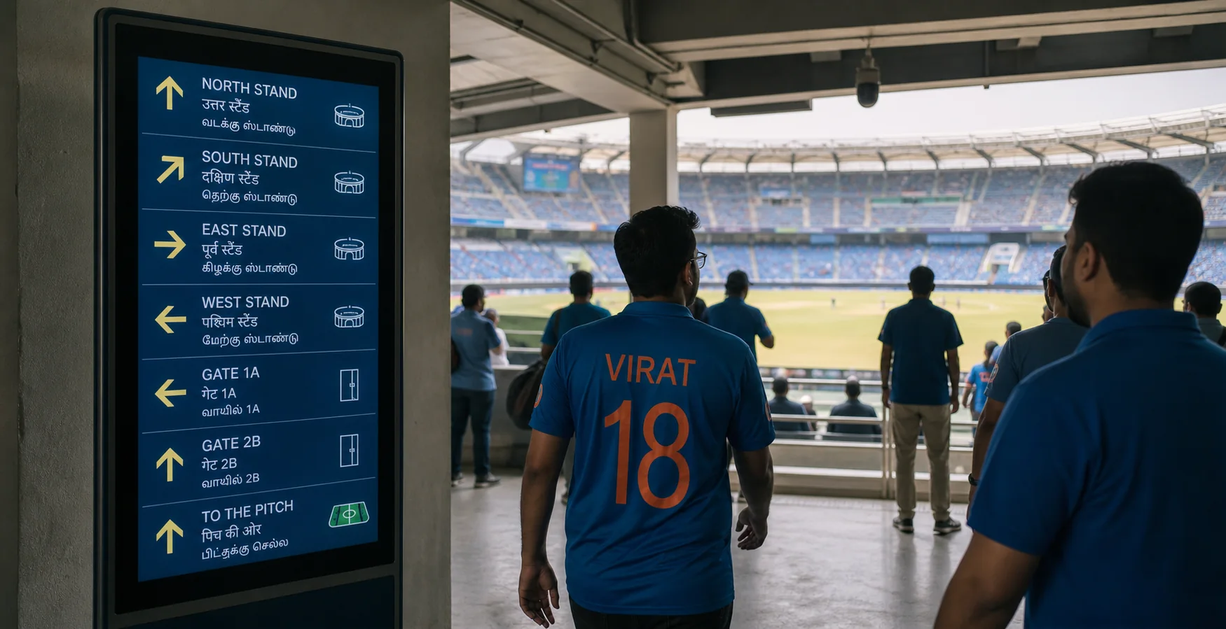
Digital signage is often purchased as a display network, but on event day it becomes a public instruction channel. At Indian venues serving audiences with different language preferences, the crucial question is whether a person can understand the action quickly. Use plain language, consistent icons, colour cues, and location references that match what people can see around them. The venue should make this choice deliberately rather than inheriting it from a default setting. It is a decision about people, process, and physical space as much as a decision about equipment. The resulting plan should be simple enough for an event supervisor to apply without opening a technical manual.
Create a message hierarchy before designing templates. Safety and movement instructions must override commercial content, then gate updates, transport information, service notices, and programme messages can follow. Define who has authority to publish each category, who confirms field accuracy, and how the control room verifies that an urgent message appeared on the correct screens. Frontline staff need a short instruction that remains usable when communication is imperfect. Document the normal workflow and the exception workflow; both need an owner. That discipline keeps investment choices connected to a credible event-day workflow. Name the owner, the handoff point, and the manual fallback before approving a design.
Translation is an operational process, not a last-minute copy task. Prepare approved phrases for common conditions in the languages appropriate to the venue and event, then test them with people who use those languages. Keep sentences short and avoid idioms. Where screen space is limited, an icon and a steward direction may be safer than compressed text that loses its meaning. Prefer a small intervention made early to a dramatic change made after options have narrowed. Field checks should challenge the model whenever the live environment has changed. It also gives the team a practical basis for changing the approach after a debrief.
Placement determines whether a message can work. A screen above a queue may be blocked by heads, a bright window can reduce contrast, and a board at a decision point may arrive too late. Walk typical fan routes and photograph sightlines at the time of day the event will run. Include people of different heights and wheelchair users in the check. Use evidence with humility: sensors, records, and observations each describe only part of the scene. Protect the route for people who need more time, space, or assistance to act on the instruction.
Design for degraded conditions. Power loss, network faults, an incorrect playlist, and a stalled content player must not leave a critical route without guidance. Maintain static signs for exits and essential amenities, provide a method for local safe display or physical boards, and brief stewards on how to reinforce messages when the digital layer is absent. Access should be proportionate to the task, with logs that support review without creating busywork. Limit collection and visibility of personal information to what the task genuinely requires. This keeps the arrangement understandable to the people who must act on it.
Govern content data and access. Limit publishing rights, maintain an approval log for safety messages, separate advertiser scheduling from emergency control, and protect the system from unauthorised changes. If audience analytics or cameras are connected to the signage platform, document the purpose and retention rules separately; a display network does not automatically justify collecting behavioural data. An exercise should include at least one failed assumption, so recovery is genuinely practised. Rehearse the degraded mode before a crowded event makes experimentation unsafe. The same record can support a fair review when a decision is questioned later.
After each event, review message timing against field observations. Ask whether fans made the intended turn, whether staff had to repeat an instruction, and whether one language or display location produced confusion. Update templates and routes from the evidence. Good signage makes the venue feel legible before pressure builds; it is not simply animated decoration around the concourse. The mature outcome is a service the venue can explain, operate, and improve with confidence. Continual improvement depends on honest feedback from users, crews, and supervisors. That makes the next event safer to run and the system easier to maintain.